積み上げグラフというのは、棒グラフを積み上げているグラフです。
gnuplotで積み上げグラフを描く場合、rowstackedと columnstackedの二通りがあります。rowstackedは1行のデータの各列を積み 上げる場合に使います。columnstackedは1列のデータの各行のデータを積み上げる場合に使います。
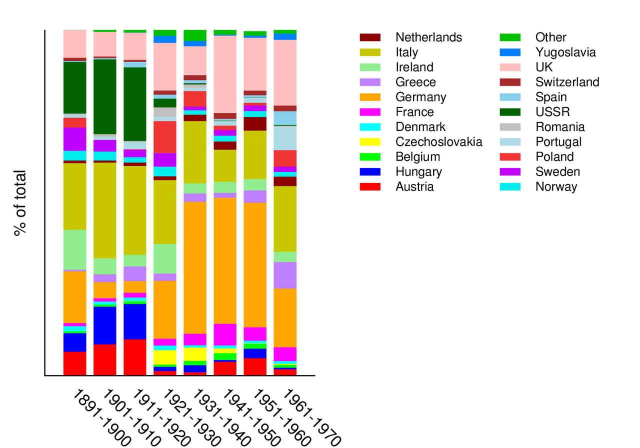
以下では例を使って説明します。gnuplotにはデモ用にimmigrantion.datというデータが付属してきます。これはアメリカ への移民人口推移のデータです。このデータの構造は
期間1 Austriaからの移民人口 Hungaryからの移民人口 ...
期間2 Austriaからの移民人口 Hungaryからの移民人口 ...
...
のようになっています。このデータを期間毎の各国からの移民人口推移を表すグラフにする場合、横軸を期間、縦軸を各国移民人口の積み上げとします。このようなグラフの場合、以下のようなgp fileの内容になります:
set terminal postscript eps color enhanced  "Helvetica,28"
set output "histograms.eps"

# ↓凡例の指定
set key outside right top vertical Left reverse
set key nobox
set key invert samplen 1 spacing 0.6 width -8 height 0
set key font "Helvetica,14"
# ↓ 欠損データの指定
set datafile missing '-'
# ↓ 積み上げグラフの指定
set style data histograms
set style histogram rowstacked
set style fill   solid 1.00 noborder
set boxwidth 0.75 # 棒グラフの幅
# ↓ 軸の指定
set grid noxtics nomxtics ytics nomytics noztics nomztics \
 nox2tics nomx2tics noy2tics nomy2tics nocbtics nomcbtics
set border 3 front linetype -1 linewidth 1.000 # x1, y1軸のみを描く
set xtics border in scale 0,0 nomirror rotate by -45  offset character 0, 0, 0 autojustify
set xtics  norangelimit font "Helvetica,18"
set xtics   () # x軸の目盛りを描かない
unset ytics
set ylabel "% of total" font "Helvetica,18"
set yrange [ 0.00000 : 100.000 ] noreverse nowriteback
set xrange [0:]

plot 'immigration.dat' using (100.* $2 / $24):xtic(1) t "Austria" lc rgb "red",\
     'immigration.dat' using (100.* $3 / $24):xtic(1) t "Hungary" lc rgb "blue",\
     'immigration.dat' using (100.* $4 / $24):xtic(1) t "Belgium" lc rgb "green",\
     'immigration.dat' using (100.* $5 / $24):xtic(1) t "Czechoslovakia" lc rgb "yellow",\
     'immigration.dat' using (100.* $6 / $24):xtic(1) t "Denmark" lc rgb "cyan",\
     'immigration.dat' using (100.* $7 / $24):xtic(1) t "France" lc rgb "magenta",\
     'immigration.dat' using (100.* $8 / $24):xtic(1) t "Germany" lc rgb "orange",\
     'immigration.dat' using (100.* $9 / $24):xtic(1) t "Greece" lc rgb "purple",\
     'immigration.dat' using (100.* $10 / $24):xtic(1) t "Ireland" lc rgb "light-green",\
     'immigration.dat' using (100.* $11 / $24):xtic(1) t "Italy" lc rgb "dark-yellow",\
     'immigration.dat' using (100.* $12 / $24):xtic(1) t "Netherlands" lc rgb "dark-red",\
     'immigration.dat' using (100.* $13 / $24):xtic(1) t "Norway" lc rgb "dark-cyan",\
     'immigration.dat' using (100.* $14 / $24):xtic(1) t "Sweden" lc rgb "dark-magenta",\
     'immigration.dat' using (100.* $15 / $24):xtic(1) t "Poland" lc rgb "light-red",\
     'immigration.dat' using (100.* $16 / $24):xtic(1) t "Portugal" lc rgb "light-blue",\
     'immigration.dat' using (100.* $17 / $24):xtic(1) t "Romania" lc rgb "gray",\
     'immigration.dat' using (100.* $18 / $24):xtic(1) t "USSR" lc rgb "dark-green",\
     'immigration.dat' using (100.* $19 / $24):xtic(1) t "Spain" lc rgb "skyblue",\
     'immigration.dat' using (100.* $20 / $24):xtic(1) t "Switzerland" lc rgb "brown",\
     'immigration.dat' using (100.* $21 / $24):xtic(1) t "UK" lc rgb "pink",\
     'immigration.dat' using (100.* $22 / $24):xtic(1) t "Yugoslavia" lc rgb "web-blue",\
     'immigration.dat' using (100.* $23 / $24):xtic(1) t "Other" lc rgb "web-green"
:xtic(1)は xticlabels(1)の略表記で、column 1のstringをx軸のlabelに使う指定です。この場合は期間を表す文字列を指定しています。
上の例では、各columnをすべて書き下したものですが、gnuplotにはiterationの文法もあります。実際、demoではfor を使ったiterationで簡潔に指定しています。